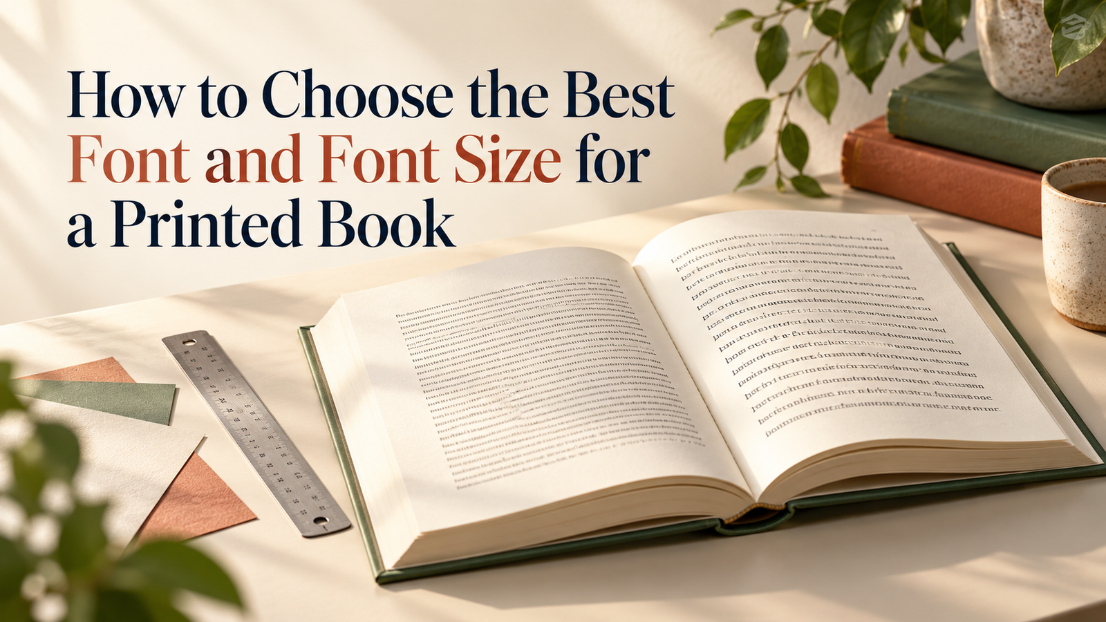
How to Choose the Best Font and Font Size for a Printed Book
Printed book font size affects how comfortable your book is to read.
A book’s cover makes the first impression, but its interior design shapes the reading experience. If the font is difficult to read or the text is too small, readers may struggle to stay focused—even when the content is excellent.
So, what is the best font and font size for a printed book? The answer depends on your book’s size, content, and readers. Here is a simple way to make the right choice.
Choose a Font That Is Easy to Read
For novels and other books with long passages, start with a clear, familiar font such as Garamond, Palatino, or Georgia. These fonts give the page a classic book appearance and are comfortable to read.
For workbooks, guides, and books with many short sections, a clean font such as Arial may also work well. You can use a more distinctive font for chapter titles, but keep the main text simple and consistent. Amazon KDP likewise recommends fonts that are easy to read across long passages and suggests reserving elaborate styles for headings. kdp.amazon.com
If your book contains Tamil, English, or other languages together, check that the font displays every letter and symbol correctly before printing.
What Font Size Should You Use?
For most standard text-heavy books, 11 or 12 pt is a good starting point for the main text. IngramSpark gives the same general range for a standard book interior. www.ingramspark.com
A smaller size may suit a compact reference book, while a larger size may be better for a children’s book or an audience that prefers larger text. Remember that two fonts set at 11 pt can look quite different. Always judge the size on a printed page, not only on your screen.
Match the Font Size to the Page
The finished dimensions of your book-called its trim size-affect how the text looks. A font that feels balanced on an A5 page may look too small on a larger page. Page margins and the width of each line matter too.
When you change the book size, review the interior layout again. Do not simply enlarge or shrink the whole page and assume the text will remain comfortable to read.
Give the Lines Enough Space
The space between lines is called line spacing or leading. Lines that are too close together make a page feel crowded. As a starting point, try spacing about 2 pt greater than the font size-for example, 11 pt text with roughly 13 pt line spacing—and adjust it after viewing a printed sample. Wider lines may need a little more space. www.adobe.com
Keep Headings and Supporting Text Clear
Chapter titles, section headings, captions, and footnotes should be easy to distinguish from the main text. Use the same styles throughout the book so readers can follow its structure.
Avoid making footnotes or captions so small that they become difficult to read. Saving a little page space is rarely worth making important information uncomfortable to see.
Print a Sample Before Finalising
The most reliable way to choose a font is to print a few sample pages at the book’s actual size. Try two font options or sizes, then read several pages—not just one paragraph.
Check whether:
- The text is comfortable to read for a long period.
- The page looks balanced rather than crowded.
- Bold and italic words remain clear.
- Headings and page numbers are easy to find.
- All characters print correctly.
A printed sample helps you catch problems that are easy to miss on a screen.
Final Thoughts
The best font for your printed book should help readers concentrate on your words. Begin with a readable font and an 11–12 pt body text sample, then adjust the size, spacing, and margins to suit your book and audience.
Ready to see your manuscript in print? With BookPrintz, you can print your book on demand in India and start with just one copy.